How to Draw Cute Pixel Art Characters from Scratch (Beginner’s Guide)
Affiliate Disclosure
This post contains affiliate links. Pixels and Bloom may earn a commission when you purchase through these links, at no additional cost to you. All opinions are our own and we only recommend products we believe will genuinely benefit our readers.
There’s a particular magic to a well-made pixel art character. A handful of carefully placed pixels, a limited palette of maybe six colors, a canvas no bigger than 32×32 and somehow, a personality emerges. A little wizard with tired eyes. A cat with a bow tie and an attitude. A knight whose helmet is slightly too big for their head. The constraint of the medium, paradoxically, makes characters feel more expressive, not less.
If you’ve ever looked at a charming pixel art character and wondered how to make one yourself, this guide is for you. We’re going to walk through the entire process of drawing cute pixel art characters from absolute scratch from understanding proportions and anatomy at small sizes, through building your first sprite step by step, all the way to adding shading, personality details, and the finishing touches that separate a flat placeholder from a character people actually connect with.
This is a beginner’s guide, but it doesn’t talk down to you. We’ll cover real technique the same approaches used by the pixel artists whose work fills the 25 pixel art inspo accounts to follow on Instagram you’ll want to bookmark after reading this. We’ll also connect these skills directly to more advanced character work, like our guide on how to create a Disney princess in pixel art, which builds directly on everything you’ll learn here.
If you haven’t yet chosen your pixel art software, start with our best pixel art software in 2026 guide. For this tutorial, we’ll reference Aseprite as the primary tool, it’s the industry standard and available for around $20 but the techniques apply equally to any pixel art application.
Why Cute Characters Work So Well in Pixel Art
Before we draw anything, it’s worth understanding why cute characters are so natural in pixel art. The answer comes down to a concept called chibi proportions a stylistic approach borrowed from Japanese illustration where characters have oversized heads relative to their bodies, simplified facial features, and round, soft body shapes.
Chibi proportions are ideal for pixel art at small canvas sizes for a specific reason: the face is where personality lives. Eyes, eyebrows, mouth, the tiny movements of these features convey everything we need to read a character’s mood and identity. By giving a character a large head, you allocate more pixels to the face, which means more expressive potential per character. A 32×32 sprite with a head that takes up roughly half the total height has enough room to show genuine emotion. The same character with realistic proportions would have a face of maybe 6–8 pixels almost nothing to work with.
This is why almost every beloved pixel art character from the original Mario to modern indie game sprites to the kawaii-style characters we explore in our 25 Kawaii pixel art character ideas post uses some version of exaggerated, simplified proportions. It’s not a beginner shortcut. It’s the correct aesthetic choice for the medium.
The Foundations: Proportions and Planning
Understanding Head-to-Body Ratios
In realistic human proportions, the body is approximately 7–8 heads tall. In chibi/cute pixel art style, we shrink this dramatically:
- 2-head ratio (head = half total height): Maximum cuteness, very limited body detail. Works beautifully at 16×16.
- 3-head ratio (head = one third total height): The most versatile and popular ratio for cute characters. Plenty of face space, enough body room for distinctive clothing and accessories. Works well at 32×32.
- 4-head ratio (head = one quarter total height): Slightly more realistic, still stylized. Better for characters that need complex outfits or equipment. Best at 48×48 or 64×64.
For your first cute pixel art character, we recommend a 32×32 canvas with a 3-head ratio. That gives you roughly 10–11 pixels for the head and face, 8–9 pixels for the torso, and 8–9 pixels for the legs and feet. It’s enough room to be expressive without being overwhelming.
Sketching Your Character Concept
Even in pixel art, a little planning before you touch the grid saves enormous time. Before opening your software, think through these questions:
Who is this character? Give them a role or personality archetype, wizard, knight, baker, witch, adventurer, cat person, robot. The clearer your concept, the more focused your design decisions will be.
What’s their dominant color? Pick one primary color that will define the character visually. This becomes the basis of your palette and the thing that makes the character instantly recognizable at a glance.
What’s their defining feature? Every memorable character has one or two visual elements that do most of the identity work, a distinctive hat, an unusual hairstyle, a signature accessory, a characteristic expression. Know yours before you start.
What mood do you want? Cheerful and energetic? Calm and cool? Mischievous? Melancholy? This informs your color palette choices (warm vs. cool tones) and your facial expression design.
You don’t need to draw a full sketch, a few words and rough notes are sufficient. The clearer your concept, the more efficiently you’ll work on the grid.
Building Your Color Palette
Before you place a single pixel, build your color palette. This is one of the most important and most overlooked steps for beginners.
How Many Colors Do You Need?
For a cute character at 32×32, a well-structured palette typically uses 12–20 colors total, organized into color “ramps”:
- Skin tones: 3 colors (base, highlight, shadow)
- Hair: 3 colors (base, highlight, shadow)
- Primary clothing color: 3 colors (base, highlight, shadow)
- Secondary clothing color: 2–3 colors (base, shadow or base, highlight, shadow)
- Eyes: 2–3 colors (iris color, pupil, highlight)
- Outline: 1 color (usually a very dark version of each area’s base, or a single dark near-black for the whole character)
That’s 17–19 colors for a fully shaded character. You can simplify by using flat colors with no shading (great for a clean, graphic look) or by sharing colors between ramps where it makes sense.
Choosing Colors That Work Together
The most common beginner mistake is choosing colors that are either too similar (muddy, indistinct shading) or too different (harsh, cartoonish shading that looks disconnected from the base color).
The golden rule for shading ramps: Your highlight should be lighter and slightly warmer than your base. Your shadow should be darker and slightly cooler. This principle warm highlights, cool shadows is borrowed from traditional painting and makes shading feel natural and three-dimensional rather than flat and grainy.
For example, a skin tone ramp might be:
- Highlight: #FFCBA4 (warm peach)
- Base: #D4956A (mid warm tan)
- Shadow: #8B5E3C (cool dark brown)
For an in-depth look at how this principle applies to specific character types including the beautiful, rich palettes used in Disney-style character art see our guide on how to create a Disney princess in pixel art: grid, colors and tips.
Working with Established Palettes
If color theory feels overwhelming right now, use a pre-designed palette from the Lospec palette library. Palettes like Resurrect 64, Endesga 32, and AAP-64 are specifically designed to include well-balanced ramps for skin, hair, and clothing — you just pick the colors within them that suit your character. Using an established palette also guarantees color harmony across your whole piece.
Step-by-Step: Drawing Your First Cute Pixel Art Character
We’re going to walk through building a complete cute character, let’s use a small witch as our example. She’ll have a pointed hat, a simple dress, and a friendly expression. Here’s how to build her from nothing.
Step 1: Block Out the Silhouette
Open Aseprite. Create a new canvas at 32×32 pixels. Zoom in to at least 8x (so each pixel displays as an 8×8 block on your screen, use the View menu or scroll wheel to zoom).
Start with a single flat color, pick any distinctive color, like a bright red. Don’t worry about your final palette yet. Just block out the basic shape of your character using this single color.
The head: Draw a roughly circular shape about 10 pixels wide and 10 pixels tall, centered around the horizontal midpoint of the canvas, positioned in the upper third. A circle on a pixel grid isn’t perfectly round, it’s more like a hexagonal blob. Something like this (using X for filled pixels):
  X X X X X X
 X X X X X X X X
X X X X X X X X X
X X X X X X X X X
X X X X X X X X X
X X X X X X X X X
 X X X X X X X X
  X X X X X X
This 8-wide, 8-tall shape is your head base. Don’t stress about perfection, you’ll refine it.
The hat: Add the witch’s pointed hat sitting on top of the head. A flat brim about 10 pixels wide, then a triangular cone rising 6–7 pixels above that.
The body: Below the head, add a simple trapezoid shape for the torso and skirt, wider at the bottom than the top, about 10 pixels wide at the hem and 14–16 pixels tall from shoulders to hem. Keep it clean and simple.
Arms: Short horizontal extensions from the upper sides of the torso, 2 pixels thick, 3–4 pixels wide. At this scale, hands are just 2×2 pixel blobs.
Legs and feet: Two 2-pixel-wide rectangular legs extending downward from the bottom of the dress by 3–4 pixels, ending in slightly wider 3-pixel foot blobs.
You now have a silhouette. Step back (zoom out to see it at normal size, use the preview panel in Aseprite) and assess the overall shape. Does it read as a character? Is the head the dominant element? Are the proportions pleasing?
Step 2: Refine the Outline
Now work over your rough silhouette with a clean, intentional outline. Switch to a very dark color near-black, like #1A1A2E or similar. Trace a clean 1-pixel outline around every edge of your character.
Key rules for clean pixel art outlines:
Avoid single-pixel corners. Where two lines meet at a right angle on a curved surface (like the top of the head), the corner pixel often creates an unwanted sharp spike. Remove single isolated corner pixels, the curve reads more naturally without them.
Keep diagonals as clean stair-steps. A diagonal line in pixel art is a staircase, each step is 1 pixel right and 1 pixel down. Consistent stair-stepping reads as a smooth diagonal. Inconsistent steps (sometimes 1×1, sometimes 1×2) create lumpy, irregular curves.
Separate elements clearly. Your hat should be visually distinct from your hair, which should be distinct from your face. A 1-pixel outline is usually enough separation, but sometimes you need a 1-pixel gap between elements to keep them readable.
Step 3: Fill in Base Colors
With your outline in place, use the fill tool to flood each area with its base color:
- Skin tone for the face and hands
- Hair color for any visible hair under the hat brim
- Hat color (classic witch: purple or dark teal)
- Dress color (complement the hat, try a deep navy or forest green)
- Shoe color (dark, contrasting)
At this stage your character looks flat and simple. That’s exactly right. You’re laying the foundation.
Step 4: Design the Face
The face is the most important part of your character and deserves careful attention. At 32×32 with a 3-head ratio, your face area is approximately 8–9 pixels wide and 5–6 pixels tall. Here’s how to use that space:
Eyes are the dominant feature. For a cute character, eyes should be large relative to the face typically 2–3 pixels wide and 2 pixels tall. A simple cute eye: a 2×2 filled dark square (the iris), with 1 pixel of highlight (usually white) placed in the upper-right corner of the iris. This single highlight pixel transforms a flat square into a living, expressive eye.
For extra cuteness, try circle eyes a 3×3 shape with the corners removed, giving a rounded feel, or dot eyes just single pixels, which read as beady and either menacing or adorably simple depending on context.
Eyebrows are optional at this size but add enormous expressiveness with just 2–3 pixels each. A flat 2-pixel horizontal brow reads as neutral. Angled inward (\ /) reads as concerned or angry. Angled outward (/ ) reads as surprised or worried. Raised high reads as cheerful or innocent. For our witch, try slightly arched brows for a knowing, confident expression.
Mouth options at this scale: a single pixel smile (just 1 pixel, slightly off-center or centered), a 3-pixel open smile (one pixel for each corner curving up, one for the bottom of the open mouth), or a small straight line for a neutral or deadpan expression. Our witch gets a small curved smile friendly but a little knowing.
Blush marks optional but very effective for cute characters are 2–3 small pink pixels placed under each eye. They immediately push the character into kawaii territory and add warmth. Use them deliberately they change the character’s mood significantly.
Step 5: Add Shading
Now add depth with your highlight and shadow colors. Identify your light source, for most character sprites, top-left or top-right is conventional.
Work area by area:
Face: Add the highlight tone to the forehead (top 2 rows of the face), the tip of the nose (a single pixel or 2×1 shape), and the top of the cheeks. Add the shadow tone under the chin (bottom 1–2 pixels of the face) and on the side away from the light source.
Hat: The cone gets a highlight stripe 2–3 pixels wide running up the side facing the light. The brim is mostly shadow on its underside (1 pixel of shadow color along the inner bottom edge). The top of the brim catches the light source.
Dress: The front center of the dress is the base color. The sides and folds (if you add them even 1–2 pixels of shadow color along the side edges creates a sense of volume) move toward shadow.
Hair: Add a bright highlight strip 1–2 pixels wide along the top of the hair mass (where the light hits most directly), and a shadow at the base where hair meets neck.
Resist the urge to add too many shading tones at this small scale. Three tones per color region (base, highlight, shadow) is almost always sufficient. More tones at 32×32 tends to look muddy rather than refined.
Step 6: Add Details and Personality
This is the step that transforms a technically competent sprite into a character people connect with. Details to consider:
Hat details: A hat band with a buckle or a little star or moon shape. A tiny witch character without any hat detail looks generic, one small motif makes it memorable.
Dress details: Small button dots down the front. A tiny apron. A collar or cuffs in a contrasting color. A small pocket with something peeking out of it.
Accessories: What’s she holding? A tiny wand (a 3-pixel diagonal stick with a 2×2 star tip). A broom (recognizable even at 3–4 pixels). A small potion bottle. A tiny black cat sitting at her feet (literally 5–6 pixels but completely readable as a cat).
Expression refinement: Now that the character is mostly complete, look at the face again. Does it feel right? Does the expression match the personality you intended? Sometimes a single pixel change, raising an eyebrow by 1 pixel, adding a tiny tooth to the smile, adjusting the highlight position in the eye transforms the character’s personality dramatically.
Step 7: Review at Actual Display Size
This step is essential and constantly skipped by beginners. Zoom out to 1x or 2x and look at your character at something close to display size. Does it still read clearly? Is the silhouette recognizable? Are the eyes still expressive?
Many things that look good at high zoom become muddy or confusing at actual size. Use Aseprite’s preview panel (open it from the Window menu) to see your character at multiple sizes simultaneously while you work.
Common Beginner Mistakes and How to Fix Them
Pillow shading: Shading that follows the outline of the shape (lightest in the center, darkest at the edges) rather than responding to a light source. Looks flat and artificial. Fix by committing to a specific light direction and shading accordingly, highlights on one side, shadows on the other.
Too many colors: Using 30+ colors on a small character creates visual noise and destroys the crisp readability that makes pixel art work. Audit your palette, if you have five slightly different shades of the same blue, consolidate them to three.
Inconsistent outline weight: Mixing 1-pixel outlines with 2-pixel outlines creates an unintentionally messy look. Pick one and stick with it throughout the character.
Floating pixels: Isolated single pixels that aren’t connected to the main form, usually appearing as stray marks after editing. Zoom in carefully and clean these up before finalizing.
Ignoring the silhouette: If your character’s silhouette isn’t readable as a clear, distinctive shape, no amount of interior detail will fix it. The silhouette is read first, interior details are read second. If you close your eyes halfway and your character becomes a featureless blob, your silhouette needs work.
Creating Character Variations
Once you’ve made your first character, variations are much faster to produce and they’re extremely useful for print-on-demand products, social media content, and building a cohesive character universe.
Palette swap variations: The same character sprite with different color palettes reads as different characters instantly. A blue-palette version of your witch feels completely different from the purple original, even though you haven’t moved a single pixel.
Expression sheets: Redraw just the face area with different expressions happy, sad, angry, surprised, sleepy, in love. Keep the body identical. This is the foundation of character animation and is a genuinely fun exercise in emotional communication at tiny sizes.
Seasonal costumes: Your character in a Christmas hat, a witch costume for Halloween, a flower crown for spring. These make excellent social media posts and seasonal product designs for Printify a consistent character in different seasonal outfits builds a recognizable brand across a product line.
Size and age variations: Chibi (smaller, rounder), teen (slightly taller, more defined), adult (more realistic proportions). Exploring how the same character reads across different proportion styles deepens your understanding of pixel art design.
From Characters to a World
Once you’re comfortable drawing individual characters, the natural next step is placing them in context. A character in front of a simple background immediately suggests narrative who are they, where are they, what’s happening?
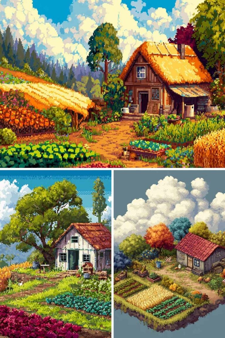
The 15 Stardew Valley inspired pixel art pieces you can recreate post is a wonderful resource here Stardew Valley is one of the most masterful examples of characters and environments working together in pixel art, and studying those designs will level up your world-building instincts significantly.
For character work specifically aimed at social media and personal branding, our posts on 10 pixel art PFP ideas that look great on any platform and 30 pixel art avatar ideas for your social media profiles take the character skills from this guide and apply them directly to building a pixel art identity online.
And if you’re ready to tackle Disney-level character complexity, the rich shading, the expressive features, the iconic designs in our dedicated guide on how to create a Disney princess in pixel art is your next step. Everything you’ve learned in this tutorial forms the foundation of that more advanced work.
Sharing and Selling Your Characters
Once you’ve built a roster of original pixel art characters, there are genuine income opportunities worth exploring:
Print-on-demand: Your characters on t-shirts, stickers, tote bags, and mugs through Printify. Character stickers in particular perform extremely well on platforms like Redbubble. Our full guide to the top pixel art print-on-demand shops for selling your designs covers the complete setup process.
Digital asset sales: Sprite sheets, character packs, and icon sets are in constant demand from indie game developers. Platforms like Itch.io and Gumroad are natural homes for this kind of asset sale.
Commissions: Once you have a strong portfolio of original characters, commissions, custom character designs for clients are a natural income stream. Post your work consistently on Instagram and Twitter/X with clear commission availability signals.
Your Workspace for Character Design
Long character design sessions require a comfortable workspace. If you’re spending hours placing individual pixels, physical comfort directly affects the quality and duration of your creative output.
A height-adjustable standing desk from Flexispot is worth the investment for any serious pixel artist. The ability to alternate between sitting and standing across a long session maintains your focus and reduces the physical strain of screen-heavy, precision-focused work.
For input devices, a high-DPI Razer mouse gives you the cursor precision that pixel-level character work demands especially during the outline refinement and shading stages where individual pixel placement determines whether your character looks professional or amateurish. If you prefer stylus work, Razer drawing tablets integrate cleanly with Aseprite for a natural drawing feel.
Final Thoughts
Drawing cute pixel art characters from scratch is one of the most rewarding skills you can develop as a digital artist. The learning curve is real but relatively short with a few dozen characters under your belt, the process becomes genuinely fast and intuitive. What felt like painstaking technical problem-solving in your first sprite becomes creative flow by your twentieth.
Start with one character today. A 32×32 canvas. A handful of colors. A simple concept. Follow the steps in this guide, make something imperfect and your own, and then make another one. The characters get better every time, and somewhere in that process you’ll find yourself with a cast of tiny, expressive figures that feel genuinely like yours.
If you want more inspiration for what to draw, our posts on 50 cute pixel art ideas to draw when you need inspiration, 25 Kawaii pixel art character ideas you’ll actually want to draw, and 30 easy pixel art ideas perfect for absolute beginners are full of starting points for your next character.
Go make something.
More Pixel Art Posts You’ll Love
- What Is Pixel Art? A Complete Beginner’s Introduction
- Best Pixel Art Software in 2026: Honest Review for Every Skill Level
- How to Create a Disney Princess in Pixel Art: Grid, Colors and Tips
- Top Pixel Art Print-on-Demand Shops for Selling Your Designs
- 50 Cute Pixel Art Ideas to Draw When You Need Inspiration
- 30 Easy Pixel Art Ideas Perfect for Absolute Beginners
- 25 Kawaii Pixel Art Character Ideas You’ll Actually Want to Draw
- Cool Pixel Art Pieces That Went Viral on Social Media
- 15 Disney Pixel Art Designs Fans Have Recreated (And How They Did It)
- 10 Pixel Art PFP Ideas That Look Great on Any Platform
- 40 Small Pixel Art Grid Ideas You Can Finish in Under an Hour
- 25 Pixel Art Inspo Accounts to Follow on Instagram
- 15 Stardew Valley Inspired Pixel Art Pieces You Can Recreate
- 30 Pixel Art Avatar Ideas for Your Social Media Profiles
- 50 Christmas Pixel Art Designs to Celebrate the Holiday Season
- 47 Thanksgiving Pixel Art Designs to Celebrate the Season of Gratitude